Overview
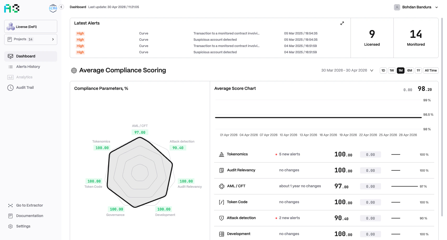
The Dashboard aggregates scoring data from all projects in the currently selected portfolio. It refreshes automatically; the last refresh time is shown in the header (Last update: DD MMM YYYY / HH:MM:SS).
The Dashboard’s labels and categories are configured per organization. You may see “Average Risk Scoring” or “Average Compliance Scoring” depending on your setup. Category names and the two quick-stat labels also vary by organization.
Quick Stats
Two summary numbers appear at the top-right of the Latest Alerts card:Latest Alerts
The Latest Alerts card lists the four most recent alerts across all projects. Each entry shows:- Severity badge —
INFO,LOW,MEDIUM,HIGH, orCRITICAL - Project name — the originating project
- Context value — a human-readable metric snapshot (e.g. TVL values, transaction details, a price change)
- Timestamp — date and time the alert fired
Scoring Section
This section gives a portfolio-level snapshot across all configured categories. Use the time-range selector (1D / 1W / 1M / 6M / 1Y / All Time) to control the period shown.
Risk / Compliance Parameters Chart
A radar chart (hexagonal or multi-axis polygon) plots the current score (0–100) for each configured category. Each axis represents one category. The shape of the polygon indicates overall health — a full outer polygon means all categories score 100. Scores are color-coded:- Green — healthy (near 100)
- Orange / Yellow — moderate risk
- Red — elevated risk (near 0)
Average Score Chart
A time-series line chart shows how the composite average score has changed over the selected period. The current score and its delta are shown in the top-right corner (e.g.▼ 2.50 64.33).
Per-Category Breakdown
Below the charts, each category is listed as a row containing:- Icon and name
- Alert count — e.g.
452 new alertsorno changes - Current score — e.g.
42.00 - Score delta — change badge (red = score dropped)
- Trend sparkline — mini chart showing score history
- Percentage bar — score on a 0–100% scale